Figure 1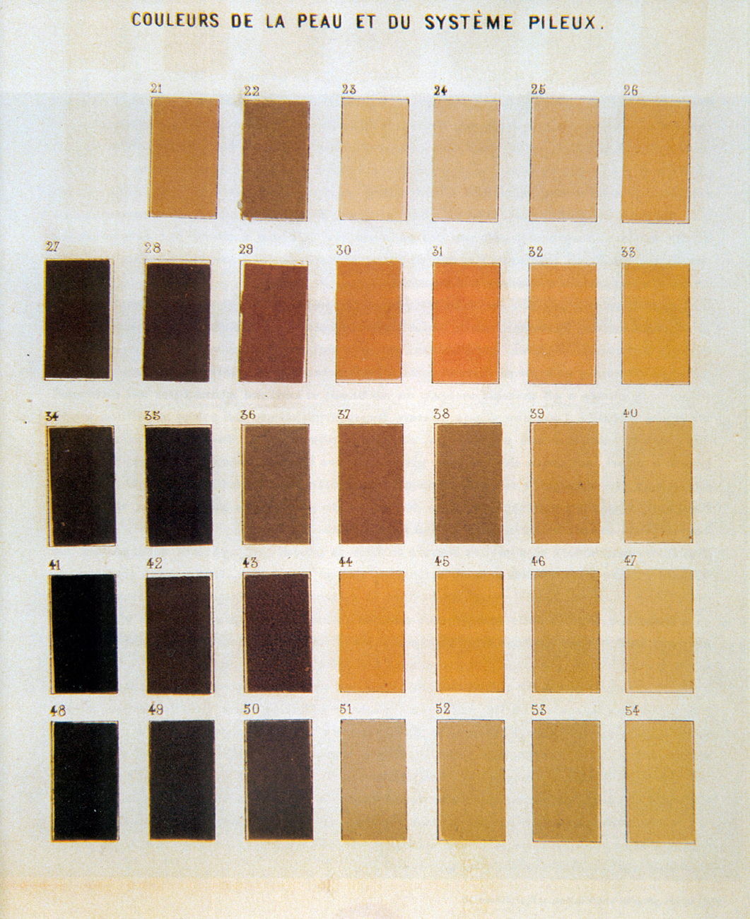 Paul Broca. “Couleurs de la peau et du système pileux” (Colors of the skin and of hair growth), 1865. From Société d’anthropologie de Paris, Instructions générales pour les recherches anthropologiques (anatomie et physiologie) (1865).p. 7
Note 1. Angelíca Dass
The irony seems so immediately legible. In Humanæ, a series of photographs by Brazilian artist Angelíca Dass, each figure stands face forward, head and shoulders posed against a solid background, uncovered except for such occasional adornments as tattoos, jewelry, body piercings, head scarves. The backgrounds of the portraits and the color of the sitters’ skin accord uncannily, and each photograph bears a label summing up the conjunction between the sitter and their surroundings. A pale man with sad eyes is “Pantone 61-8 C.” A pinkish baby is “Pantone 95-8 C.” A woman with a slight smile is “Pantone 324-7 C.” No two Pantone numbers repeat.1
The literally color-coded portraits suggest a parody of the human sciences’ classificatory obsessions—in particular, the history of racial science in Brazil. The nineteenth-century naturalist Louis Agassiz, for example, traveled through Brazil taking prurient black-and-white photographs of the people he encountered, in the name of scientific classification.2 Present-day South-Americanist scholars debate how, precisely, to interpret the many names for skin color used in Brazil. Is it the case, as Marvin Harris argues, that “races do not exist for the Brazilians?”—just descriptors for skin color? Or is it rather, as Robin Sherif counters, that “Brazilians . . . do not conceptualize race as a simple dichotomy between black and white, but rather they recognize and name many intermediate categories: Moreno, mulato, sarara, marrom bom-bom, to cite but a few.”3 Is the breakdown of racial optics in the face of empirical precision the ultimate focus of Dass’s portraits?
Perhaps. And yet her vision of chromatic particularity has an unsettling literalness—a hint not of parody but of sincere, technocratic egalitarianism predicated on the technologically mediated intelligibility of skin color as an index of subjectivity. Consider the interpretation offered by Alejandro Castellote, a photographer and critic, who writes that Dass’s use of “technically rigorous” Pantone numbers “gives the collection a degree of hierarchical horizontality that dilutes the false preeminence of some races over others based on skin color or social condition.” He describes the Pantone backgrounds as a “safe medium” where the “socio-political context p. 8 of the racial problem” can be “displaced”—insofar as, within the Pantone system, “primary colors have exactly the same importance [as] the mixed ones.”4.
“The racial problem” becomes a problem of systematic uniformity; typology of race becomes subsumed by typology of industrial color; a social calculus is replaced by the mathematics of bodies integrated across a matrix of ostensibly objective colors. The irony seems not so immediately legible.
Note 2a. Pantone
The Pantone Matching System is among the most ubiquitous color-matching systems in the world. The system consists of 1,114 standardized colors keyed both to common printing processes (such as CMYK offset printing, the so-called process colors) and to proprietary inks made and sold by Pantone (“spot” colors). In the words of Pantone’s marketing materials, “the PANTONE formula guide provides an accurate method for the selection, specification, communication, reproduction, matching and control of solid PANTONE MATCHING SYSTEM Colors, the international printing publishing and packaging color language.”5
Note 2b. Pantone
Labeling colors by their code names allows users of the Pantone system to specify colors with great confidence as they work with other users of the Pantone system. And where printing is concerned, users are everywhere—across global networks of production, Pantone is the assumed color-matching standard of printing and printmaking, and digital reproduction and design software almost invariably come bundled with trademarked Pantone color-matching software.6
Figure 2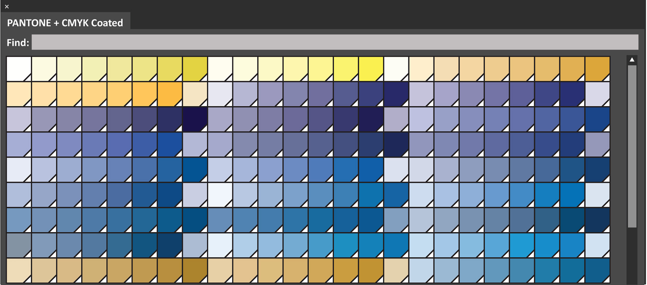 A small section of the Pantone swatch menu that comes with Adobe Illustrator, a ubiquitous desktop publishing program, 2018. Moreover, Pantone color books specify the sort of surface that the referenced color is to be printed on (“uncoated” or “coated”—i.e., absorbent or nonabsorbent). This should serve as a reminder of the difficulties of separating abstract color qualities from material substances—whether that substance is paper or skin. To match her subjects’ skin color to their appropriate Pantone hue, Dass takes a digital sample of an area of her subjects’ skin and uses a software p. 9 version of Pantone’s matching system to key the sample “exactly” to its Pantone equivalent—an automation of subjective visual judgment that Castellote describes as “not only formal [but also] ethical.”7
Note 3. Makeup
In the early twentieth century, before it was an international leader in standardized color, Pantone was a small printing company located outside Hoboken, New Jersey, with a specialty in cosmetics matching cards.8 This is a different sort of skin-color matching system.
Note 4. Paul Broca
In 1864—at roughly the same time Agassiz was busying himself taking scandalous photographs of Brazilians—the bulletin of the Société d’anthropologie de Paris reported that its founder and chief editor, the physiologist and anatomist Paul Broca, had successfully filled a major gap in scientific technique by completing a table of standard colors for identifying the hair color and skin color of human beings around the world. These colors were not based on Broca’s mere conjecture, memory, or speculation but on rigorously gathered empirical observations. The Société assured its members that Broca had based his tables on several hundred samples from individuals of all races, ages, and sexes, as well as from anthropological and ethnographic digests. In his zeal to compile a sample of every possible chromo-physiological type, Broca had left no stone unturned. For instance, when he was unable to obtain his own sample of “albino hair,” Broca turned to one of the Société’s members, M. Morpain, who helpfully supplied a sample. In another instance, M. Pruner-Bey allowed Broca access to his “huge and unique collection of hair”—an unappetizing but doubtless helpful turn.9
Figure 3 Pantone. Color book and representative swatches, 2010. In order to execute this radical separation of color-in-general from color-in-particular, Broca enlisted the aid of M. Perret, a p. 10 functionary of the Gobelins tapestry works who had assisted another scientist, Michel Eugen Chevreul, in Chevreul’s 1834 effort to compile a general standardized, rationalized color system for use in the tapestry factory.10
His collaboration with anthropologists and tapestry manufacturers allowed Broca to assemble a table of skin colors so fine that some observers concluded its early versions revealed no gradation between the different, labeled colors. In all, the final table sported thirty-four shades of skin color, each identified by number. While Broca had initially thought to make separate charts for skin color and hair color, ultimately the overlap between the two categories was deemed sufficient to permit both kinds of human colors to occupy the same chart.
Figure 4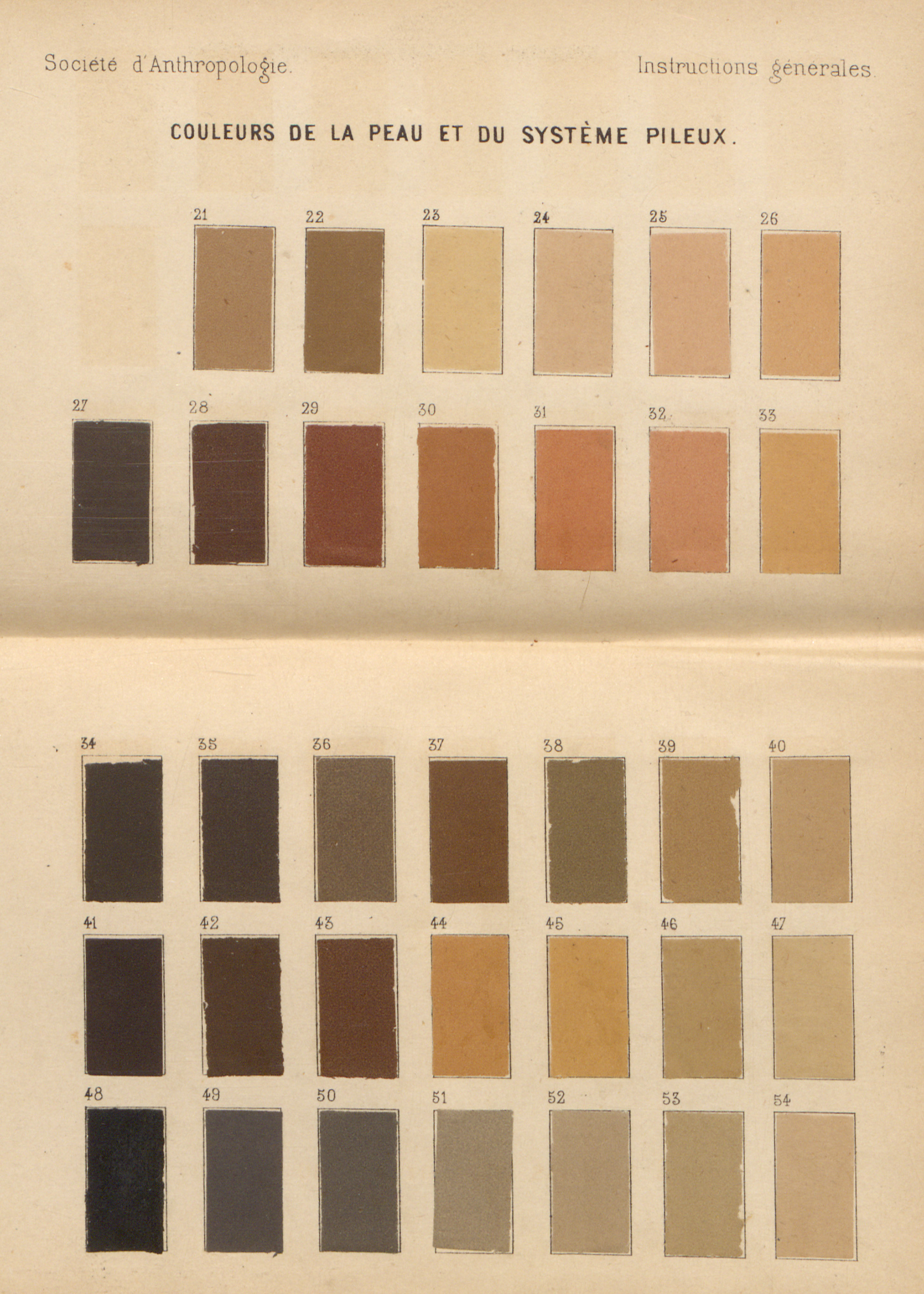 Paul Broca. “Couleurs de la peau et du système pileux” (Colors of the skin and of hair growth), 1865. From Société d’anthropologie de Paris, Instructions générales pour les recherches anthropologiques (anatomie et physiologie) (1865). Broca published the tables in his Instructions générales pour les recherches anthropologiques (1865), a compendium of guidelines for researchers in the human sciences. p. 11
Note 5. Race and Type
What was the point of this painstaking work?
After all, as John Beddoe—fellow of the Royal Society, founder of the British Ethnological Society, and president of the British Anthropological Institute—noted in 1905, many in the British anthropological community insisted “‘color was no part of type’”; that is, they doubted whether skin had anything do with defining “race.”11
As a case in point, Beddoe cited his own mentor, Sir Henry Rawlinson, who noted that, while Herodotus had written in the fourth century BCE about a race of dark-skinned, curly haired “Egyptians” who inhabited the area on the eastern shores of the Black Sea, by the nineteenth century the people of Georgia had pale skin and, not infrequently, light hair. By the same token, Beddoe quoted other colleagues who believed that pale-skinned, redheaded Celts had “degenerated” from swarthy Levantines in ancient times. If races could change color like this, then of what use was color in keeping track of type?12
For Beddoe, however, skin color was not only a salient measure of race—it afforded a unique precision in classification. On a trip around the world in 1885, Beddoe had some opportunity—though not as much as he would have liked—to measure the skin color of the people he encountered. Using Broca’s charts as a guide, he took measurements of color from places on his informants’ bodies that he felt least likely to have been discolored by sun exposure, such as their upper arms—a means of ensuring the untainted truth of their skin colors. This, in turn, allowed him to roughly classify and rank the people he tested, such that, for instance,
The darkest shade met with in the clothed skin was far removed from black. It was 42, a deep reddish yellow, and occurred in purity only once among the 35 New Guinea men (in a mainlander from Wagga-wagga), twice in the New Hebrideans (Arulap and Malicolo), and three times among the Australians. This fairly represents the position of these three races, if I may call them so, in the scale of colour, the Australians being the darkest, and the New Guinea men the lightest.13
Notice the subtle but pervasive causal claim that Beddoe embeds in his hierarchy: the “races” Beddoe encounters (if he may call them so) are defined according to color. Race, therefore, does not precede color as an analytic category; rather, color precedes race.
This power of discrimination was important, for while others of his peers were devoted to the idea that “colour in man, being merely superficial, is of very small account compared with … osteology”—and thus devoted their time to the deep matter of weighing bones and measuring skulls—Beddoe saw skin color as p. 12 an avenue to knowing the most profound characteristics of human beings. Skin color reflected the psychology of types and the embodied cultural capacities of a people, over and above mere morphology. Reflecting on the traditional observation—one that Beddoe attributed to Hellenic Greece—that peoples’ coloration corresponded to character traits, he wrote,
That there was a basis of truth beneath the ancient doctrine no careful observer can doubt. Thus in lunatic asylums one sees the victim of mania usually with sanguine traits, the melancholic and the insane epileptic most often with straight dark hair. Persons of highly nervous temperament, thought-readers, seers, prophets, are mostly either very black or extremely fair.14
Color, moreover, was not simply a way of tracing the development of races from the past to the present; it was also a prognosis of things to come. Was the racial makeup of England changing? Beddoe thought so. “I regret,” he wrote, “the diminution of the old blond lympho-sanguine stock, which has hitherto served England well in many ways, but is apparently doomed to give way to a darker and more mobile type, largely the offspring of the proletariat, and more adapted to the atmosphere of great cities.” Amid the war and urbanization of the twentieth century, Beddoe saw “the higher types of Scotchmen” growing gradually darker, and his thinking took a maudlin turn as he wondered of these new people, “Will the coming race be able to retain what these men have died to win?”15
At issue, then, was not that Beddoe doubted human beings could transform over time. Rather, the salient facts about these transformations were precisely those characteristics that remained visible indicators of character type—hair color, eye color, skin color. Human beings might change, but, for Beddoe, color remained permanently central to who they were, as individuals and as populations. Color was the definition of—rather than a property of—race.
Note 6. Permanence
After Broca died in 1881, his assistant at the Société d’anthropologie de Paris, Paul Topinard, endeavored to re-create a small subset of Broca’s charts, the originals of which had badly discolored in the years since their first publication. This pointed to a problem of colorimetric anthropometry that mirrored in miniature the slipperiness of racial types themselves: for while the littoral peoples of the Levant might have transformed into orange-haired Celts over thousands of years, colors printed on paper changed much faster.
Even the original author of the standard had difficulty replicating his results. As Beddoe noted, Broca had lent a hand in replicating his skin color charts for the influential British field guide Notes and Queries on Anthropology (1874). And yet, Beddoe complained, p. 13
22 is yellower and lighter in the British [version of the charts], 24 is grey rather than pink, 25 is a lighter shade of pink, 28 is lighter and redder, 29 is lighter, 30 is less red, 31 is not of quite so deep a red, and includes (perhaps) a small modicum of yellow; 32 is pinker and lighter, 33 lighter, 36 lighter, 38 is lighter and less grey, 45 is lighter, 46 darker and greyer, 52 is yellower and less grey; 53 and 54 are left out in the British Queries.16
Note 7a. Francis Galton
As president of the British Royal Anthropological Institute in the 1880s, Francis Galton did not express much interest in the measurement of skin color. His own work tended toward more traditional—if somewhat obsessive—statistical numeracy, as evidenced in, for instance, his studies of “weights of British noblemen during the last three generations,” “head growth in students at the University of Cambridge,” and the somewhat fanciful “measure of fidget.”17
Nevertheless, insofar as Galton felt that the “cui bono of making any measurements at all” was “to define the individual and the race,” it was important to have properly calibrated and standardized measuring tools. As such, he acknowledged that something had to be done about the state of Broca’s tables.18
The solution came to him on a trip to Rome. As he told a gathering of the institute’s members in 1887, having noticed the permanence of color in ancient mosaics, Galton was inspired to visit the “Vatican manufactory” that supplied the Holy See with tiles for contemporary mosaic projects and was delighted to discover that, out of “forty thousand bins of color,” 10,752 were classified (by a simple numerical system) and 500 matched the “flesh tints appropriate to European nations.” This suggested to Galton that a small slab with perhaps as few as six sections of color embedded in it should be simple to produce. The samples, labeled A–F, would match Topinard’s efforts to salvage Broca’s chart. In this way, slabs and their sample colors “could be distributed among the existing Anthropological Institutions and Museums, and would form practically un-alterable standards of reference whence painted copies might be made from time to time, as often as desired, for the use of travelers [sic].”19
The only problem, Galton worried, might be price. Another member of the institute replied that, if tiles from Rome were too expensive, it should not be a problem to find a tile maker in England who would do the job.
Note 7b. A Modest Proposal
As evinced by his modest proposal for rejuvenating Broca’s charts—a mere six tiles out of the original thirty-four—absolute fidelity to skin color was not a principle concern for Galton. p. 14 Nevertheless, the attempt to place colorimetry on a similar foundation as other metrics of humankind—weight and measure, in particular—speaks to the presence of color as an established indicator of natural type, even if it was a difficult indicator to quantify.20 No less a racial skeptic than Franz Boas held out Galton’s color samples as exemplary of the sort of work needed—though, he insisted, “It is impossible to obtain a numerical standard of color; it is only possible to get a set by which we can be guided.”21
Note 8. Felix von Luschan
No permanent color standards, enamel or otherwise, emerged from either the Royal Anthropological Institute or the Société d’anthropologie de Paris. In 1905, however, Felix von Luschan, director of the Museum für Völkerkunde (Ethnographic Museum) in Berlin published a series of thirty-six graded and labeled rectangles of opaque glass for use in classifying skin color.
Figure 5 Felix von Luschan. Hautfarben-Tafel (Table of skin colors), ca.1900. Museum Collection © President and Fellows of Harvard College, Peabody Museum of Archaeology and Ethnology, PM2005.1.168. What did these colored rectangles mean to von Luschan? It is difficult to say. German anthropologists of the late nineteenth century generally maintained a greater distinction between “race” and “culture” as analytical categories than their Anglophone peers, but by the early twentieth century this custom had started to change. For von Luschan, color as a metonym for race seems to have been a suspect concept. “There is no more a yellow race, as there is a red one,” he wrote in undated notes. “We are accustomed to call redskins the American Indians but we know now that they are not really red. . . . And [just] so the races of Earlier Asia are not more yellow than the Italians or the inhabitants of Southern France.”22 p. 15 Similarly, at an address given during the 1911 Universal Races Conference in London, he insisted that “colour of skin and hair is only the effect of environment. . . . Fairness is nothing else but a lack of pigment.”23 Color, that is, had nothing to do, really, with the true science of human beings.
This attitude gave von Luschan—alongside colleagues such as Boas, who had likewise worked at the Museum für Völkerkunde—a reputation as an outspoken antiracist. In the United States his insistence that “black” and “white” people were both of the same “stock”—and therefore were necessarily social, cultural, and biological equals—seemed especially radical, and von Luschan appears to have relished telling audiences that, on individual bases, whites could indeed be far the inferiors of blacks.
However, those who saw von Luschan as a supporter of the “amalgamation” of the world’s races—either politically and economically or, more intimately, through “sex association,” as one commentator wrote—would be mistaken.24 Having denounced the science of racial distinction before the United Racial Congress, von Luschan turned his attention moments later to an equally strong endorsement of eugenics.
Among the direst challenges facing “civilized nations” was that p. 16 of “racial mixing,” he told his audience. This was not least the case in the United States—“with their twelve millions of colored people”—and von Luschan expressed sympathy with the “feeling of racial antagonism that is now directed [in the United States] against immigration from Asia and the immigration of less desirable elements from Eastern Europe.”25 What would happen when these two populations mixed? Nobody could be sure. Ethnographic science, von Luschan pointed out, had little knowledge “about the interesting and complicated psychology of the coloured races,” and anthropologists were “absolutely ignorant as to the moral and intellectual qualities of half-castes.” As such, von Luschan advocated more research into these topics, with the proviso that “the respect due by the white races to other races and by the white races to each other can never be too great, but natural law will never allow racial barriers to fall.”26
Thus, while von Luschan insisted that color was an unscientific way of classifying human beings, he also insisted that people whom he described as “colored” posed a peril to those who were best described as “whites.” Were the glass blocks in von Luschan’s scale therefore intended to be indicators of the former understanding of color or the latter? Were they meant to be indicative simply of individuals’ skin tones (in a manner reminiscent of Dass), or did they represent races of “colored” people? It is difficult to say.
What is clear is that, for researchers with less complicated epistemological and ideological commitments than von Luschan, the color samples provided by the scale served as a reasonable touchstone for continuing the project of aligning the phenomenological properties of skin color with the social, cultural, and cognitive capacities of different peoples. In 1927 and 1928, for instance, the Field Museum in Chicago launched an expedition to acquire anthropometric data on the “Eskimos and Indians of Labrador.” In addition to a “Martin’s anthropometer” (a device for measuring height, limb length, etc.) and several pairs of calipers, the museum’s researchers carried with them a set of von Luschan’s colored bricks, which they used to assess patches of the skin on their informants’ upper arms—a process that allowed them to report “a tendency to slightly darker skin in the Indians than in the Eskimos.”27 Similarly, in a 1931 study of the people of northern Morocco, Carleton S. Coon, a physical anthropologist at Harvard University, offered a helpful exegesis on the nature of skin color as enumerated in von Luschan’s scale:
The classification “light,” numbers 3, 7, 8, and 9, are colors such as one would normally find in Europeans with a considerable increment of Nordic or North European blood; a skin almost without pigment, and made pink by the presence of capillaries close to the surface of the skin. Under “medium” p. 17 comes the color range usually found among South European Whites of brunet stock, with black hair and dark eyes; a skin more deeply pigmented than and not as highly vascular as the former. Under “dark” are included those hues which are found, in the south of Europe, among persons in whom the possession of a slight increment of Negro blood is visible, and all shades of brown deeper than this.28
Von Luschan’s scale similarly found service measuring the skin color of American “negroes,” Zuni Indians, and the peoples of Iran, Indonesia, and Martinique, among many others.29 At a time when the alignment between race and color was still on relatively unstable ground, the scales provided an unfading commitment to the salience of color as a meaningful component of race.
Note 9a. Charles Davenport
Another way of thinking about color: In 1910, American Eugenicist Charles Davenport wished to conduct a large-scale study of “the color of the skin of descendants of matings between negroes and Caucasians.” His goal was to determine by empirical measurement the precise pattern of color differences that could be expected between a “hybrid” and his or her parents.30
To execute this study, Davenport required finer gradations than those that could be obtained using von Luschan’s scale, so he ingeniously turned to the Color Top—an educational toy sold by the Milton Bradley Company to schools for the purpose of teaching children about the principles of optical color mixing.31
The Color Top was simple to use. The body of the top consisted of a wide, flat wooden disk, with a spindle that fit through its center. The disk had one hundred gradations around its edge. Upon this flat wooden disk the researcher would place four specially prepared circular sheets of paper in red (R), yellow (Y), black (N), and white (W), adjusted so that a wedge of each color was visible, as were the gradations around the edge of the wooden disk. When the researcher set the top in motion, the four colors would blur, producing a unitary final color. Varying the proportion of the visible surfaces of the colored pieces of paper would allow the researcher to match the blurred color on the spinning top to nearly any desired skin color. Once a match was attained, the operator would stop the top and note—using the gradations on the side of the Color Top—the proportion of each color used.
Figure 6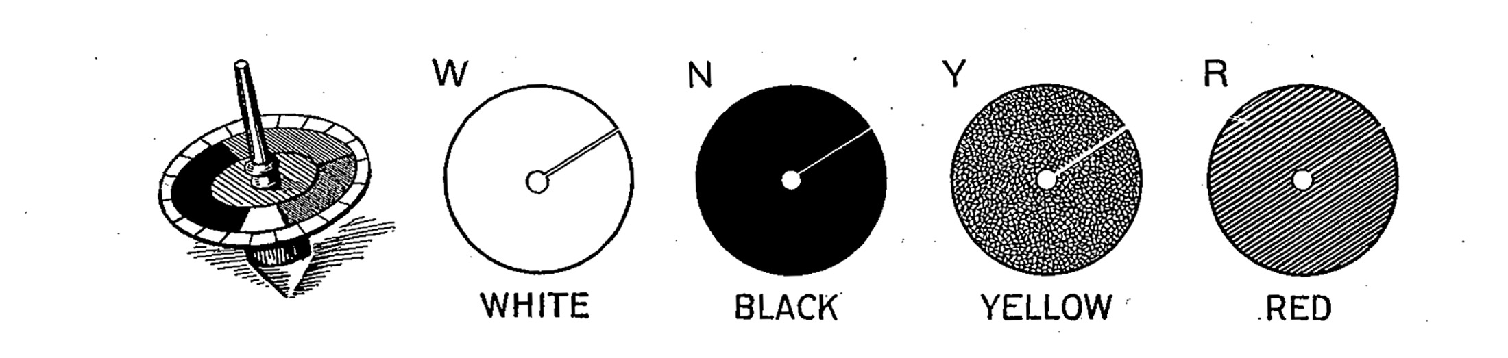 “The Color Top and Method of Adjusting the Color Disks,” 1928. From Louis R. Sullivan, Essentials of Anthropometry (1928). This test offered a level of refinement that the von Luschan scale could not match. “Of the delicacy of the method,” Davenport p. 18 reported, “there is no question; in a good light the proportions N55, R40, W5 can be readily distinguished from N53, R42, W5.” This was quite a subtle degree of difference, indeed.
The top sold by the Milton Bradley Corporation came with a full spectrum of colored circles of paper—denoted R, O, Y, G, B, P, N, and W—the better for children to experiment with color mixing. For Davenport’s purposes, R, Y, W, and N were sufficient to express any possible skin color. The proportion of “N” was of particular interest to Davenport. For example, he studied the proportion of “N” in children versus their parents, the amount of “N” in adults versus children, and so forth. That Davenport’s chosen colors are metonymic for the biological expression of races on the whole is suggested by his use of “N” for black. The full set of Milton Bradley colors contained both “blue” and “black,” so “N” made a sensible—if somewhat archaic—choice as a moniker for “black” when “blue” was also present. (When “blue” was absent, other color researchers abbreviated black as “B” or “Bk.”)32 But for Davenport, “black” did not mean simply the color “black”—“black” meant “Negro”—and thus, even with no “blue” to occupy the same alphabetic space as “black,” his color black could not bear any other moniker but “N.”
Throughout the early twentieth century, some anthropologists followed Davenport’s method, arguing that the Milton Bradley Color Top offered superior cost, convenience, and accuracy over von Luschan’s scales. Others found the top finicky and difficult to handle, preferring to use the tried-and-true von Luschan test.
Whatever its pros and cons in the practical classification of skin color, the Color Top seemed to have a social advantage that the von Luschan scale could not claim. As anthropologist H.A. Bowan noted in 1930, in contrast to von Luschan’s bricks the Color Top “raises no resentment in the subject, for it never brings home to him, as the von Luschan scale invariably does, that his color is being matched against a European or white standard.”33
This was not to say that, in the blur of the Color Top, “race” faded from an objective measure of comparative skin hue to some universal vision of subjective humanistic individualism. Quite the opposite. If the shift from colored bricks to psychophysical color mixing eliminated the overt appearance of a scale of colors between “white” and “black,” the mechanism of the Color Top nevertheless made the precise measurement of “N” more salient than ever before—embedding visual indices of race even deeper within the visual apparatus of the observer.
Note 9b. The Color Top
The general question of permanence and evanescence in the human perception of color was one that occupied Milton Bradley for much of his life. After making his fortune in board game manufacture p. 19 during the 1860s, Bradley devoted himself to the twin projects of establishing worldwide commercial standards for labeling colors and teaching American children how to perceive colors in a rational, orderly, modern, and explicitly “civilized” way.34
With the former project in mind, in 1890, Bradley published a short item in the journal Science calling for a worldwide conference to set inviolable standards for a discrete number of critical colors such as red, orange, yellow, green, blue, and purple. These colors would be defined by committee through reference to the solar spectrum, and, once identified, would be “‘reproduced in enamel, preserved like our standards of weights and measures.’” In the absence of this worldwide conference, however, Bradley had taken matters into his own hands and set standards of color in his printed papers—such that these printed papers could, when mounted on a color wheel—be used to precisely notate any color that could be seen by human eyes.35
As for the latter project, Bradley promoted his color standards as a pedagogical implement for teaching children to “see color correctly” and, moreover, in a socially “progressive” way.36 For, as Bradley believed, “Where there are no standards there can be no measurements, and if . . . we have no measurements of effects, no records can be made, and hence no comparisons of results at various places and times, and consequently no discussion and little progress.”37
Without “progress,” Bradley saw modern Americans slipping slowly behind other nations in their capacity to see, to experience, to think. “The . . . assertion is made,” he fretted,
that those semi-civilized nations whose drawings are the least artistic greatly surpass us in natural color perceptions. If color is the one thing in which we are deficient and in which we are making no advance, is it not necessary that we adopt a new line of operations for our color instruction in the primary grades?38
The Color Top was a part of this new sort of “color instruction”—one that would simultaneously preserve colors themselves against the erosions of time and the primacy of Anglo-European civilization against an atavistic retreat to semicivilization.
Note 10. Domestic Anthropometry
Bradley concisely summed up his ideal for a modern, American citizenry in his aphoristic declaration, “We must first learn to see color correctly and to know what we see.”39 This ideal, however, was not his alone.
In a September 1928 article in Women’s Wear Daily, a fashion magazine, readers found themselves urged to consider more carefully p. 20 the ways in which they classified their own skin colors.” Although one may make general classifications of colors suited to types,” wrote the prolific color and textile expert Laurene Hempstead, “specific recommendations of colors becoming to individuals should be based on analysis of their skin, hair, and eyes.”40
How to effect this analysis? “The first step,” advised Hempstead, was to “compar[e] samples of known color with the skin.” Such an analysis could help an individual to determine whether, for instance, her lips were “red-orange, red or red-violet.”41
But one could not simply stop there. A proper analysis of color-type necessarily involved other people. Hempstead advised readers to meet with a group of friends and sit in a circle, “with the members seated according to their color, the group showing gradations from cool to warm coloring.” Through this analytical device, “each member [would be] analyzed and classified according to her coloring.”42
On this human color wheel, colors did not blend but became even more distinct. “When a number of different types of so-called blonds are seated together,” Hempstead declared,
the differences in their coloring becomes [sic] so pronounced that no one having once studied such a group will ever make the mistake of thinking that they may all wear the same color or the same make-up. Seeing the so-called brunettes together, noting those of cool coloring, blue-black hair and fair skin contrasted with those of distinctly warm coloring, aids one in seeing the true coloring of individuals when they are not contrasted with others in a group. The eye thus becomes trained to recognize color distinctions.43
With this knowledge in hand—a morphological analog to the Pantone numbers in Dass’s portraits—women would not only be empowered to become more aesthetically pleasing and more efficient consumers; they also would become better citizens. The opticality of color, race, and type were deeply embedded in the development of modern technologies of color themselves. Bradley was right: learning to see correctly was learning to know.

